There’s been a lot of buzz about D3.js as of late. It seems everywhere you turn you see it: the New York Times, MTV, CNN, and the Washington Post. It’s becoming ubiquitous. The web is moving toward a more interactive and engrossing user experience, and D3.js is helping to lead the way. But we’re still just barely scratching the surface of what this library is capable of. The next generation of D3.js applications have the potential to redefine how we interact with data on the web.

So what is D3.js anyways?
Let’s start by talking about what D3 is not: a graphing library. This is an easy mistake to make. When you visit the D3 website the first thing you see are row after row of graphs. They’re shiny. They’re interesting. They’re awesome. Same thing when you look at graphics from the New York Times. This level of detail and interactivity was unheard of just a few short years ago. As a political data junkie, I love it! Really, I’m legitimately giddy. But D3.js isn’t just limited to charts and graphs. It’s not even strictly a svg library.
Charts are just the beginning.
D3 stands for Data-Driven Documents. Notice how the word “Data” is first and foremost. Data is our focus. Data is our bread and butter. With D3’s powerful data processing and DOM manipulation we could just as easily do a full ETL from a csv and dump it into a table where it can be searched, sorted, and filtered in real time. We could take this to its logical conclusion and set up a full OLAP application, putting full business intelligence at your fingertips. To put it another way: D3’s primary concern is working with data, not presentation. While this may seem counter intuitive at first, it actually opens up all sorts of new possibilities. There’s no reason we need to stay locked into charts when we can do so much more.

The Moving Parts
Before we get into everything D3 is capable of, let’s take a quick look at the basic tooling it provides us. There are three core components involved: Data import, Selection, and Presentation.
Data import
You need good clean data before you have anything that’s worth visualizing. D3 can load a multitude of different data formats out of the box including csv, html, json, text, and xml. It’s AJAX compatible, capable of issuing REST requests, and can wait for specific events to occur.
Once you have your data loaded you’re likely going to want to clean and reorganize (“transform”) it. D3 provides some fantastic tools to work with arrays, a series of mathematical operators, and formatting tools. There are also immensely powerful scale functions that we’ll touch on later.
Selections
Selections are at the core of any D3 application. They are the glue that sticks the data, the DOM, and the presentation layer together. They allow you to select a list of elements from the DOM and bind data to them. You can then manipulate these elements based upon the bound data, as well as create or destroy elements in real time. As the data changes, so does your presentation. For those interested in learning more I strongly suggest the fantastic article by Mike Bostock on How Selections Work. It provides invaluable insight.
Presentation
Now we come to the part that people generally think of when they think D3 – the cool graphics. Most of this is still done within the selection chains. We create a container then fill it with sub elements based on our data. D3 provides a long list of different svg shapes we can easily use out of the box: everything from arcs, to area plots, to chords, to cubic bezier curves. We can then change things like the object’s (x,y) position, alpha, width, and color. While we could calculate all of these by hand, D3 once again comes to the rescue with a bunch of built in scales we can lean on. This is where a lot of the hidden power of D3 lies under the hood. There are a multitude of quantitative, ordinal, and time based scales. The upshot of which is that D3 has tooling to handle pretty much any data and display problem you can think of. Math geeks, eat your hearts out.

Charts, Games, and Simulators (oh my)
I opened this blog by claiming that D3 is more than just a charting library, and yet thus far we’ve mostly just been talking about charts. What gives? Let’s look at something more fun – games and simulators.
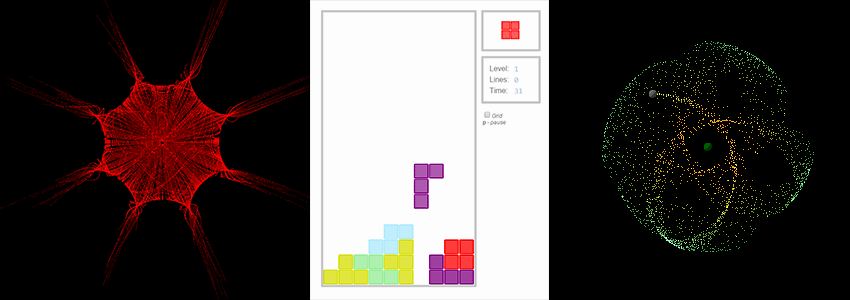
Anyone with a biology background probably remembers Conway’s game of life. It’s a basic population simulator. You set up the starting populations, then watch how they die or thrive over time. It’s easy enough to recreate with some user input, basic logic, and visualizations. In other words, a perfect fit for D3. Or perhaps you’d be more interested in playing D3.js versions of Pong or Tetris?
The important take away from this is that D3 projects can be more than just pretty charts. They can be user driven applications. Whether that means dragging things around the screen, employing brushes, or using arrow keys, there’s no reason we need to constrain ourselves to static visualizations.
While all of the examples above are interesting, they’re still a bit overly simplistic. What if I told you that D3 allows you to simulate gravity, friction, forces, and elasticity? There’s a whole section to allow you to do just that. There’s also been some pretty fine attempts at collision detection. It’s pretty cool stuff, but what are we still missing? Oh yes, particle physics! This is one of the single most interesting D3 projects I’ve ever seen. It really shows some of the cutting edge features D3 has to offer. Go play with the demos, I’ll wait.
Real Life Applications
Over the past year and a half I’ve had the pleasure to work with the team at CoClear to produce something pretty special. They’re a NYC firm providing cutting edge Business Intelligence for Lifecycle Analysis and Supply Chain optimization. If you want to lower your carbon footprint and save money at the same time, they’re the folks to talk to. For more information about what they do, check out this piece in the guardian.
When they first approached us, CoClear told us they wanted to do something entirely new. Traditional charts were insufficient to depict the kind of information they wanted to portray, and Erika Whillas had come up with some entirely new ones. They asked me if we could bring them to life.

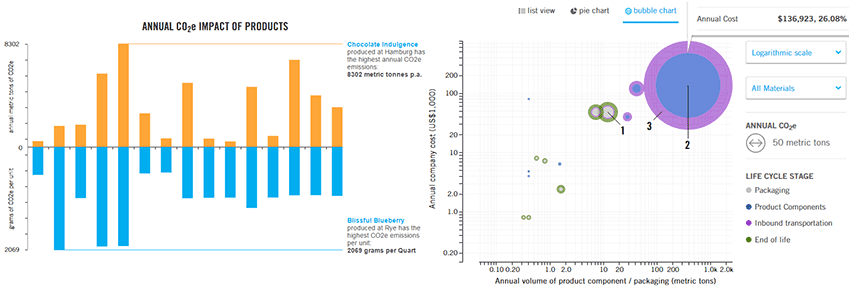
Let’s take a look at the double bar chart above. The layout allows for side by side comparison of products, both on an annual and unit emission basis. It ties the unit and gross emissions together, while still allowing you to view them independently. It also provides callouts for the products with the greatest emissions. Creating this graph involved utilizing five separate scales. In addition to the normal (x,y) positioning, the annual and unit based emissions needed to scale independently. Lastly, we used an ordinal scale with range bands to ensure that all the bars are the same width and line up properly. The end result is a single cohesive whole: two sets of data, shown together, in an instantly grokkable manner.
Next up is the “Rainbow Orbs” bubble chart. Whillas wanted a way to show the total carbon footprint for each line-item, while still allowing the user to separate out the different emissions for each Lifecycle stage (depicted here: packaging, product components, inbound transportation, and end of life). This allows the user to see the total carbon footprint, as well as what the main driving forces are. The chart also provides detailed stats in tooltips, and suggests the best places to optimize for carbon reductions (not depicted). In addition to the concentric circle design (which, to my knowledge, is the first of its kind), we also paid careful consideration to the scaling involved. We wanted to display the full axis of the chart, while respecting custom scale keys and preventing any bubbles from going off the canvas. To accomplish this we calculate the scale with the range offset by the largest bubble. We then invert the scale, sync it up with one of the custom values in our key, and find the min/max of the new domain. This ensures that everything remains on the canvas, while still allowing the custom key to depict a nice round number. With a bit of ingenuity it is possible to have your cake and eat it too.
Conclusion
Static charts and graphs are indispensable for conveying information, but we’re coming up to a point in time where they’ll become just the tip of the iceberg. Real time user driven interactions will provide an entirely new way to understand information. Speaking as a kinesthetic learner: I can’t wait! I hope this blog post has shown you some of the amazing things D3 is capable of, and has inspired you to create and explore more on your own. Remember: Charts are just the beginning.
