At Spry Group, we believe in the power of data visualization to help our clients make better business decisions. Many times, the question comes down to the visualization tool that’s best for the challenges they want to overcome.
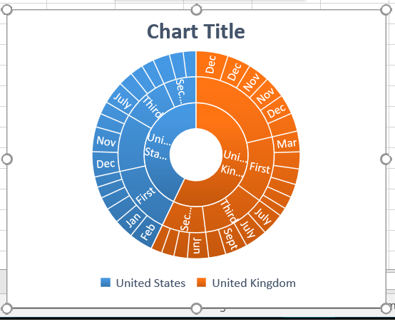
When it comes to understanding hierarchal relationships, we strongly recommend the sunburst chart. This radial chart, a variation on the treemap, breaks out general categories into subsets to better understand what components make up or contribute to the whole. From understanding revenue sources to video game menus, the sunburst chart has many practical applications. We’ll take a look at some of the most important below.
Understanding the Sunburst, starting with the Treemap
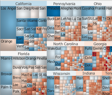
The sunburst diagram is closely related to the treemap, a data visualization technique that shows hierarchical relationships in the form of rectangles. Hierarchical relationships exist when data sets can be broken down into natural groupings.
Exports from the United States, for example, can be broken down into categories such as oil, pharmaceuticals, and vehicles. Populations can be broken down by state, country, and city. Businesses also rely on hierarchical relationships, such as portions of the budget going to different departments or the inventory categories stocked on shelves.
Lower levels of detail n the particular hierarchy take up more space in a tree diagram with groups. As the categories become fine grained they become harder to read. This is good for comparing macro-level data and giving viewers a sense of how many sub-categories there are. But it isn’t really effective when you want to drill down into those sub categories.
Enter in the Sunburst Diagram
The sunburst chart is similar to the treemap because it also shows hierarchal relationships in proportion to each other, the major difference being a radial layout over a rectangular one. The highest layer root node of the hierarchy is displayed closest to the center with deeper layers represented further out.
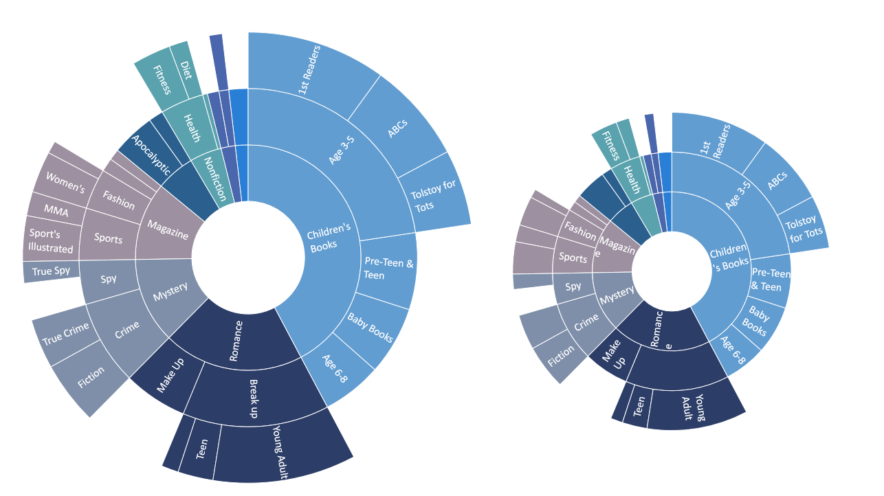
There are a few advantages to using the sunburst chart over the treemap. It’s easier to see multiple layers of data with the sunburst, while the treemap is better for comparing categories within the same hierarchical layer. In the 2012 election treemap, not only can we display just two layers of the hierarchy (state and county), but it’s also hard to read the county-level data.
There’s also evidence to suggest sunburst charts are better for helping people with task execution. In a study published by the International Journal of Human-Computer Studies, participants were asked to perform a series of file/directory-related tasks. Participants could reference treemap and sunburst charts which mapped out the computer’s directory to help them complete these tasks.
The study found that participants were better able to complete tasks with the sunburst chart when the task involved a larger hierarchy (i.e. 5,000 files). Results also suggested there might be learning effect associated with using the sunburst chart before the treemap.
Sunburst Charts in the Wild
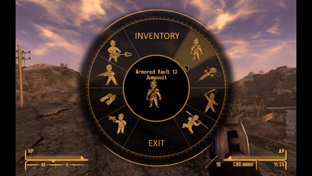
Radial Menus in Video Games
The sophistication of videos games has led to a need to display the vast array of items and options in a straightforward manner. Radial menus are essentially interactive sunburst charts: clicking on a general category opens up options under that category.
From a user-interface standpoint, the radial menu reduces the number of button clicks needed by the player and makes great use of the analog stick with console controllers. Many of today’s popular titles, including Assassin’s Creed and Halo, have incorporated this system. *Computer Storage and Management The visual advantages of sunburst charts have led to tools designed for personal computer management. Filelight, Scanner, and Space Radar are all programs that display hard drive disk space in sunburst charts, making it easy to understand what types of files and programs are taking up space.
CoClear
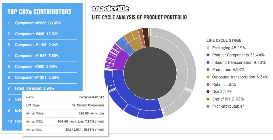
We at Spry-Group have also incorporated sunburst charts into our client’s products. Last year Spry Group helped New York Consultancy firm CoClear develop their life cycle analysis (LCA) reporting tools used to improve their clients’ carbon footprint. Combining data visualization libraries (d3.js) built from data-driven documents and CoClear’s LCA database, CoClear helps client identify opportunities to streamline their supply chain,, reduce their carbon footprint, and reduce costs. The sunburst charts are a key component to identifying and comparing those opportunities.
Moving Forward With Your Data Visualization Needs
CoClear is just one of the numerous clients Spry Group has helped. Our dedication to visualization development can make it easier for other to understand the importance of initiatives like sustainability in the energy industry. Sunburst charts are just one of the many ways data can be organized and understood. The Spry Group is ready to help find which ways are right for you.